
This week’s tip continues discussing the Analysis phase of FRACAS with some of the different types of analysis tools which can be used to help determine the root cause. Last week’s tip talked about Brainstorming and the 5 Whys. This week we’ll focus on Graphical Analysis.
Graphical Analysis
Within the context of this discussion, Graphical Analysis is used in its broadest sense. It does not mean just graphs, it includes charts and diagrams as well. Essentially any technique that can assist in organizing and/or quantifying data relating to a problem (failure incident) with the primary objective on discovering where to focus resources. Remember, not every Failure Incident will be assigned to a Problem and have an RCFA conducted (see FRACAS Analysis, Part 2).
Graphical analysis tools can help organize your failure-related data in order to determine which types of failures are causing your organization the most grief. These tools allow you to prioritize where you’ll use resources to solve the more important problems. There are a number of tools that fall into this category such as: Histograms, Scatter Diagrams, Process Flow Diagrams, Activity Network Diagrams, Tree Diagrams, Interrelationship Diagrams, Affinity Diagrams, Candy Grams … “Candy Gram for Mongo!” … wait a minute, sorry I had a movie flashback!
You get the point, there are numerous graphical analysis-type tools that are available. The internet has an abundance of free information on using them. The key, of course, is selecting the right tool for your situation. For this discussion, I’ll talk about one that I’ve used for years and have found to be very effective for identifying and prioritizing problems, particularly failure-related problems. I’m talking about the Pareto Chart.
The Pareto Chart (also called Pareto Diagram or Pareto Analysis) applies the Pareto Principle, also known as the 80/20 Rule. It is a technique used to separate “the vital few, from the trivial many”. In other words, the Pareto Chart allows you to identify the most significant problems so that you can focus your limited resources on solving those only. The Pareto Chart is best used in the following situations:
- When analyzing data for equipment-related or process-related failures. It’s best used to determine the frequency of failure incidents and/or causes.
- When there are numerous incidents and/or or causes and you want to focus on the most significant. Once again, resources are limited…separate the “vital few from the trivial many”.
- When you’re analyzing broad incidents, or their causes, and you need to look at their specific components.
- When communicating with others about your failure data. There’s seldom a more effective tool that can be used to communicate aggregate failure related information.
Below are two examples of Pareto Charts associated with both equipment-related and process-related problems.
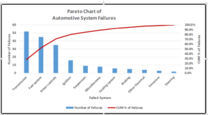
Figure 1: Simplified example of Equipment-related Pareto Chart – The top four represent 80% of the failures
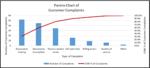
Figure 2: Simplified example of Process-related Pareto Chart – The top three represent 80% of the complaints
Pareto Charts can easily be created using MS Excel, or any other spreadsheet software for that matter. So good luck, and get started!!
In next week’s tip, we’ll continue discussing Analysis tools.
© 2017 by LinRich Solutions, LLC. All rights reserved

